Hackensack Meridian Health
Hackensack Meridian Health Branding New Jersey’s Largest Healthcare System: Hackensack Meridian Health Background In June, 2016, Hackensack University Medical Center, one of New Jersey’s and the nation’s leading healthcare providers, officially merged with Meridian Health, uniting 11 hospitals in seven counties from the New York border to the Jersey shore. The combined health care system has […]
Hackensack Meridian Health
Branding New Jersey’s Largest Healthcare System: Hackensack Meridian Health
Background
In June, 2016, Hackensack University Medical Center, one of New Jersey’s and the nation’s leading healthcare providers, officially merged with Meridian Health, uniting 11 hospitals in seven counties from the New York border to the Jersey shore. The combined health care system has 28,000 employees and nearly 6,000 physicians. Internally renamed “Hackensack Meridian Health” (HMH), it now consists of two academic medical centers, nine community hospitals, two children’s hospitals, plus 120 other locations that provide ambulatory, surgical and urgent care and assisted living services to residents of NJ and the NYC metropolitan area. Following an aborted effort to position and brand the new entity by a major global branding firm, HA Roth Consulting LLC (HARC) was retained in late July of 2016 to create a new positioning and identity for Hackensack Meridian Health… very quickly!
Challenges Faced
Finding fresh positioning ground is especially tough in the highly competitive, dynamic and too often commoditized healthcare market. Working through approvals and buy-in with newly merged leadership (including two CEO’s) in large, complex organizations like hospital systems inevitably compounds the challenge. But this branding assignment went beyond these normal hurdles by giving HARC just 60 days to accomplish its mission. Moreover, the co-CEOs had already tentatively approved a new visual identity for the combined organization.

The HARC team therefore had to improve upon this concept and then confirm it was a better solution via market-wide consumer research. All of which required devising a cohesive brand strategy, creating a fresh visual identity and house style, plus a new brand architecture system, then validating it in time to present to the Board of Directors by early October, 2016.
How We Did It
In the first 30-days HARC developed and executed:
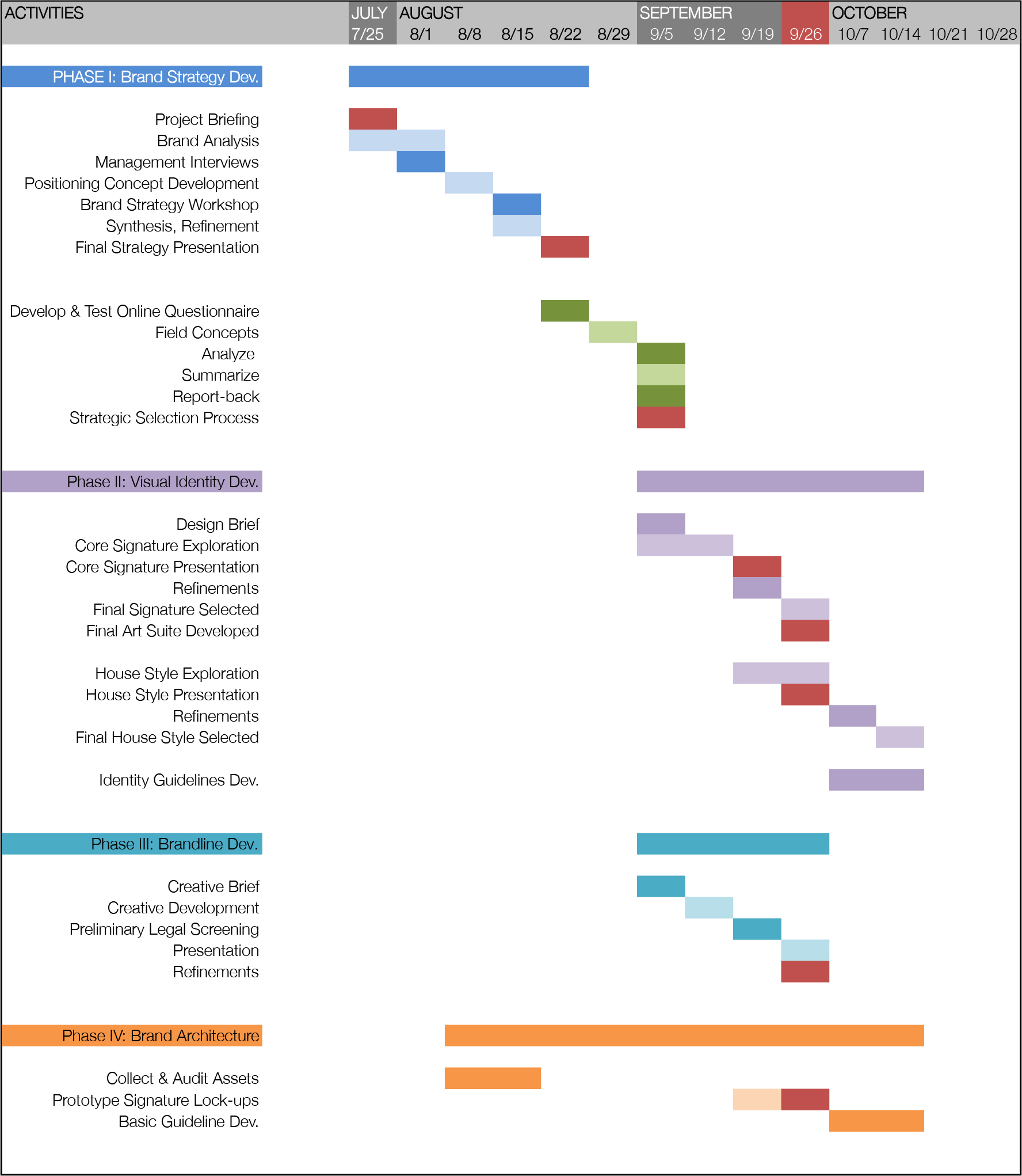
1. A Work Plan and Timeline
Clear steps, deliverables and deadlines
2. Due Diligence
Thoroughly reviewed HMH background documents, interviewed 15 senior executives across both health care organizations and analyzed over 20 competitors
3. Positioning Concepts
Created 8 separate concepts
4. Quantitative Market Research on Positioning
Tested the 3 strongest concepts via an online methodology querying nearly 1400 respondents
5. Visual Identity Development
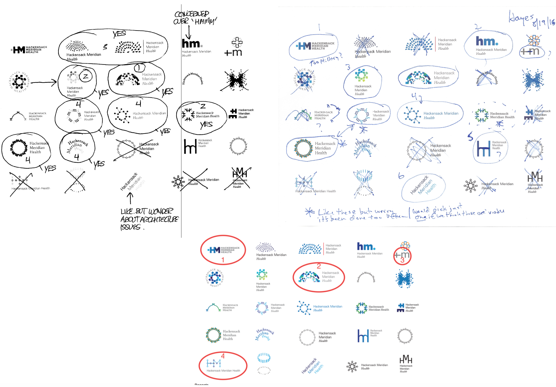
Concurrently explored over 20 potential core identity signatures
 Telling Stories
All brands need a story. This is particularly true of organizational brands where services are the primary offering and thousands of employees need to coalesce in a unified culture to deliver an on-strategy consumer experience at all levels and at all times. For HMH, we explored a broad range of potential brand stories while finishing our due diligence. These were subsequently narrowed to three strong narratives best reflecting the CEOs’ vision for the brand, its competitive differentiators and the overall strategy for the business. All three were quantitatively tested in NJ & NYC Metro and, while all had strengths, the clear overall winner was a concept we called “Well Orchestrated.”
The Winning Concept: Well Orchestrated
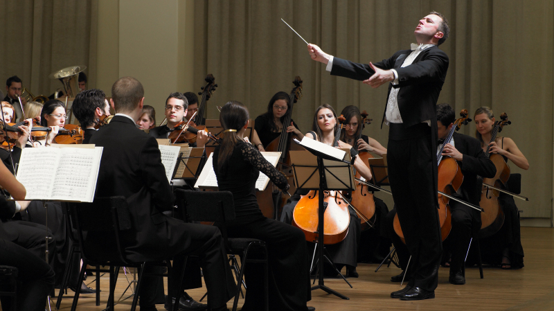
Well Orchestrated means that something is meticulously planned, highly organized and laser-focused on a specifically intended outcome. This idea inspired our brand positioning’s ultimate expression. It is about the orchestrated and fully integrated touch-points of people, processes, protocols, communication, actions and environments – the sum of all interactions harmoniously coming together – resulting in simply the best health and wellness care available anywhere. Our analysis convinced us that HMH was in a unique position to “orchestrate” and harmonize the most complete continuum of care in its market area – from its new medical school, to top-ranked academic medical centers, to urgent care centers, assisted living facilities and numerous other health and wellness services in between. But it was consumers who overwhelmingly proved the point:
What Our Target Audience Said About “Well Orchestrated”.
-
- Over half of all respondents were extremely or very likely to consider the unbranded healthcare network as described in our positioning statement.
- 92% viewing it as extremely or very believable.
Well Orchestrated was most effective communicating:
-
- A leader in integrated care
- Commitment to continuous improvement
- Dedication to research, new medical breakthroughs and discoveries
- Technologically advanced
- Treating complex conditions
Respondent verbatims were extremely strong, positive, content rich and amazingly prolific:
One of the biggest, best networks in the country … innovative and engineered to provide the best care for its people; forward thinking.
A comprehensive healthcare network that includes a new medical school, medical research, nationally ranked hospital s; offering the latest treatments and the best care available; a comfortable, caring environment.
More innovative , they work as a team ; want to be the premiere hospital and health network.
The leading healthcare facility in the area ; their nurses among the most prestigious in the nation; patients will have access to the best medical care possible. An integrated approach to healthcare focusing on both the person and the clinical.
Developing innovative and forward thinking medical curriculum with Seton Hall.
Visual Expression
Given our truncated timeline, HARC began exploring design ideas for a new core signature and identity as positioning concepts were being created and researched. Not ideal, but experience pointed us toward some key narrative strengths to build upon. We shared many early ideas with our client team for their input to speed the process, ensuring we moved forward collaboratively with the strongest work. Starting from a wide range of ideas we soon closed in on 3 we all felt were worthy of presenting to the Co-CEOs in early September, who approved them enthusiastically for qualitative testing.
Qualitative Research
Focus groups were conducted throughout the HMH geographic footprint to understand the communication profile of each proposed signature. All 3 designs communicated their primary intended message but, as with the positioning, one stood out…
The Winning Design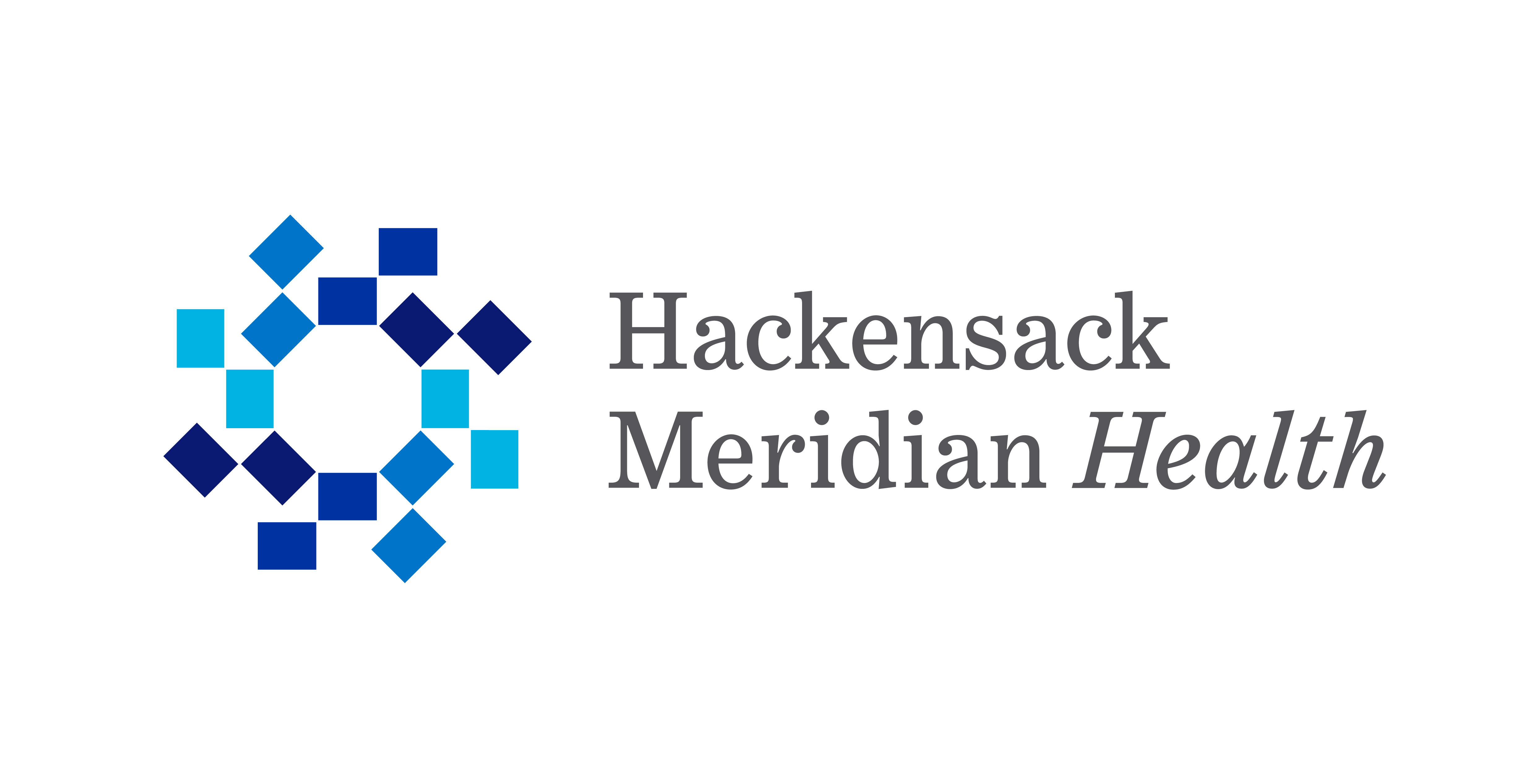 Why We Liked It
Our idea was derived from imagining an aerial view of an orchestra with sheet music on stands. Its shapes form a geometric circle suggesting continuous motion, and a continuum of partners working together in sync, forming the center of activity. It is contemporary, dignified and has a visceral appeal that immediately struck us and our clients. But more importantly…
Here’s What Consumers Saw:
-
- Connectedness
- Growth
- (Being) Organized
- Innovative
- Moving forward
- Many pieces working together
- Integrated care
Respondent Verbatims
The inner circle is like all the hospitals and then the specialties around it . They’re all connected.
Says all encompassing — we offer everything you need for health.
It’s forward motion and multiple entities; grouping together and working together; a forward moving flow.
A well-oiled wheel , always moving forward and changing .
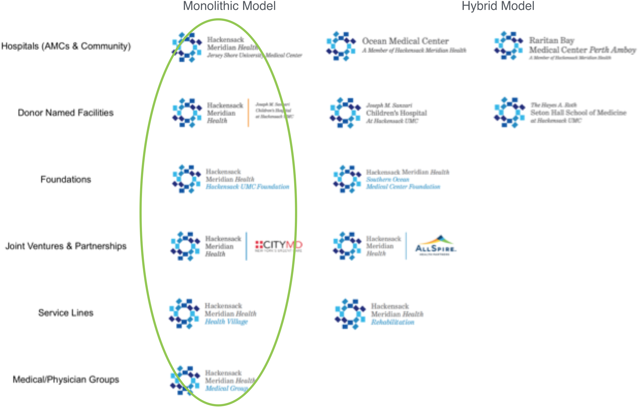
Building a Logical Brand Architecture System
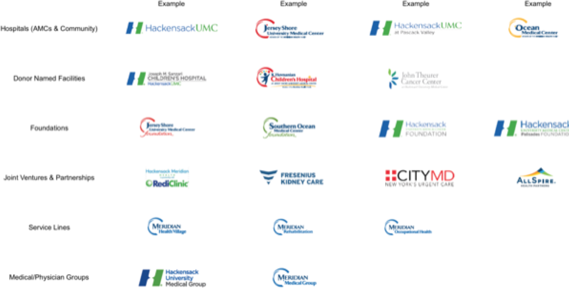
Always a delicate challenge from an emotional and internal politics standpoint, strategically-driven Brand Architecture is an essential tool for managing brand portfolios and this was a critical need for the merged hospital systems.
Where We Started
Our Solution
Building Out Hackensack Meridian Health’s New Brand
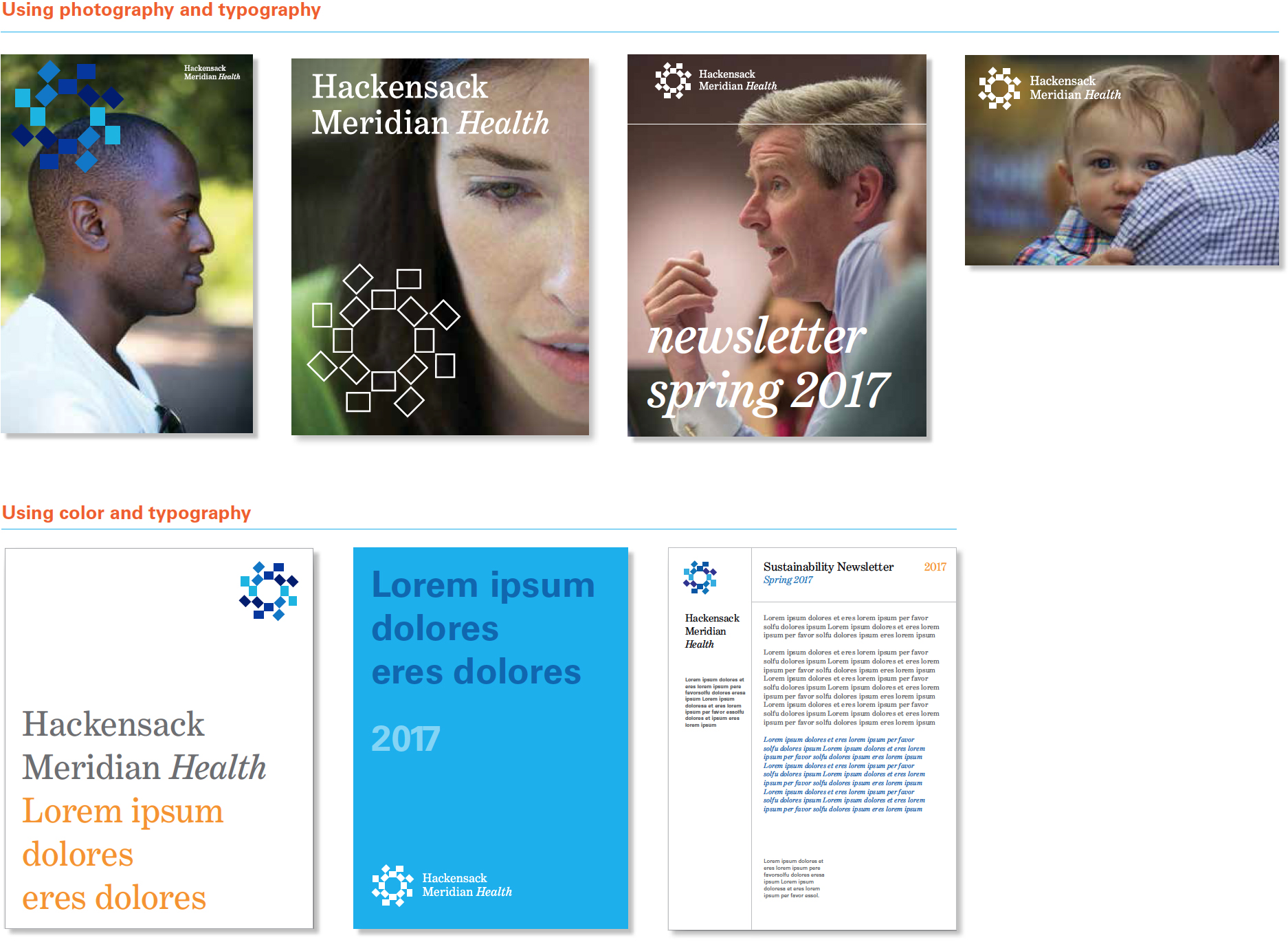
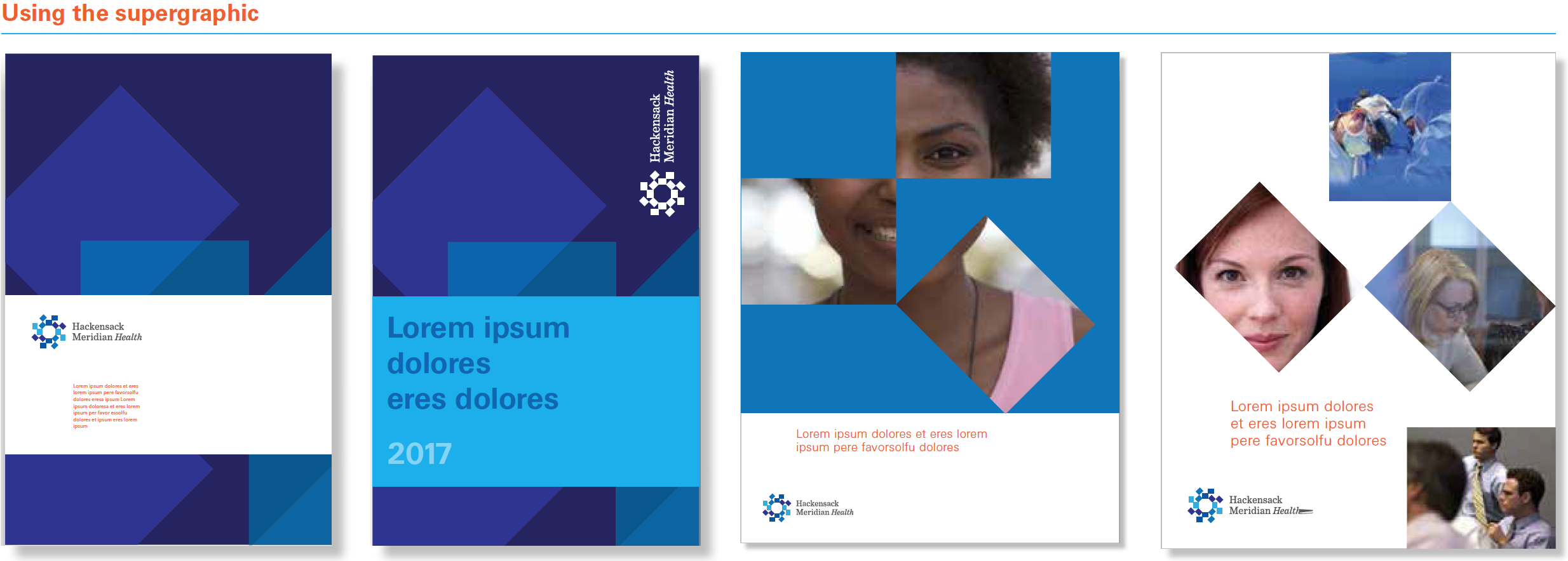
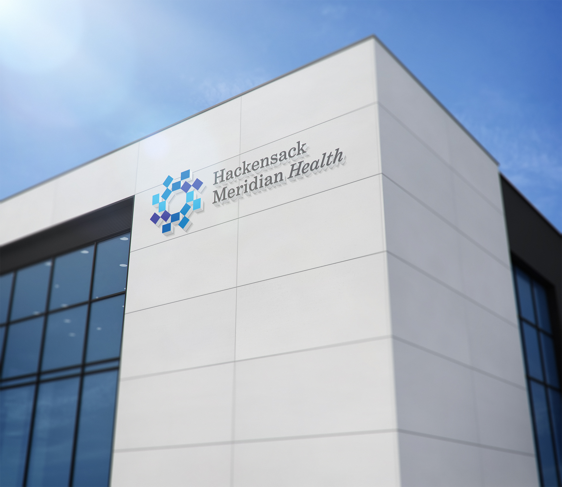
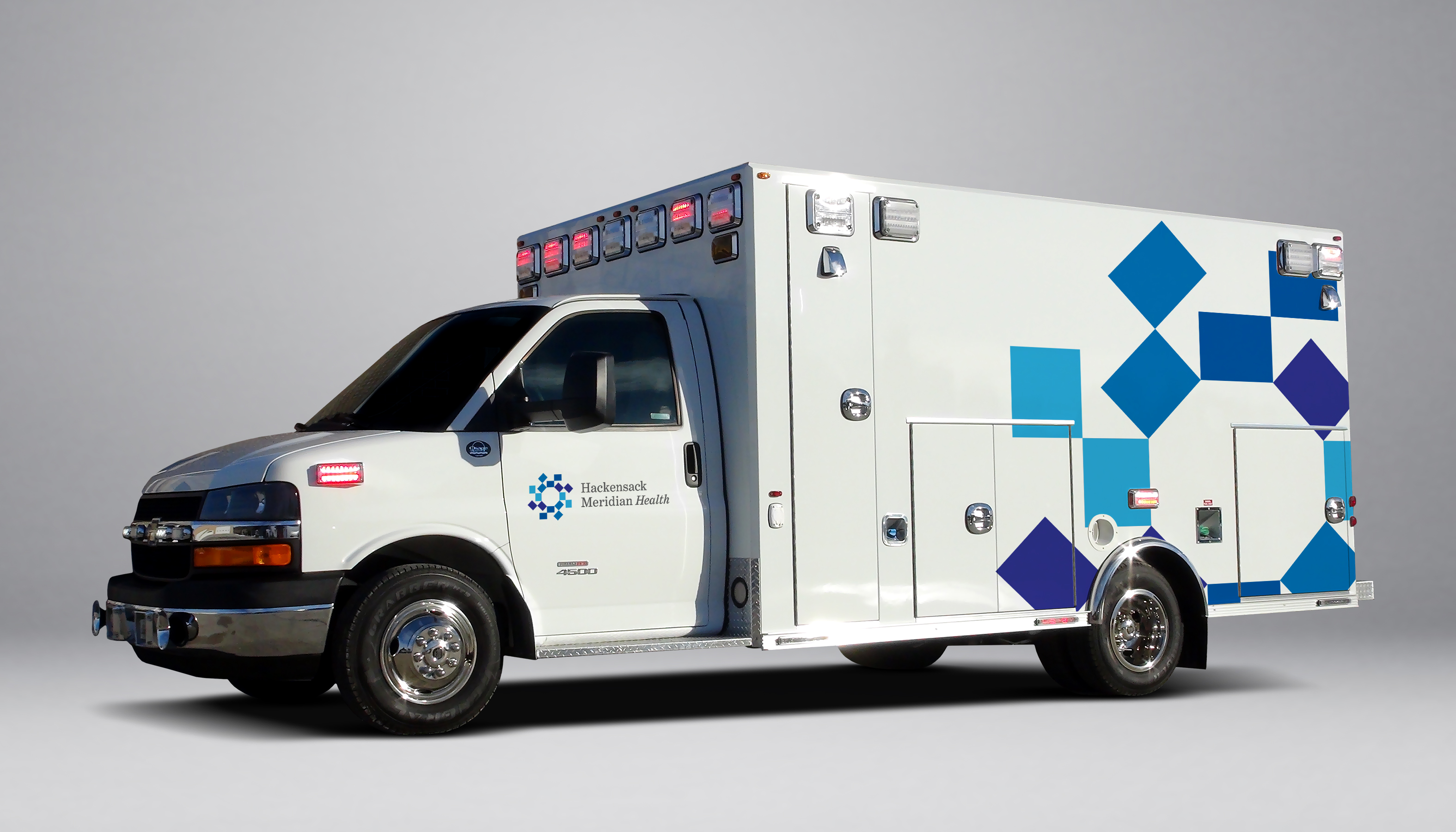
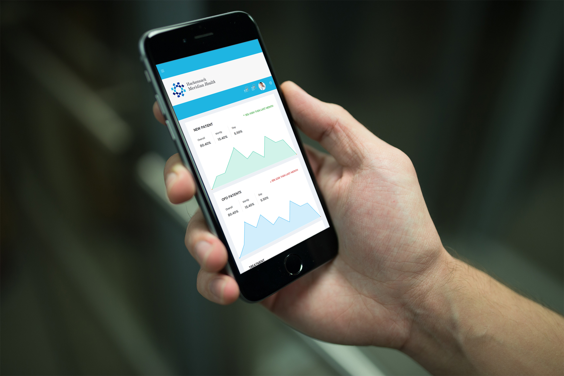
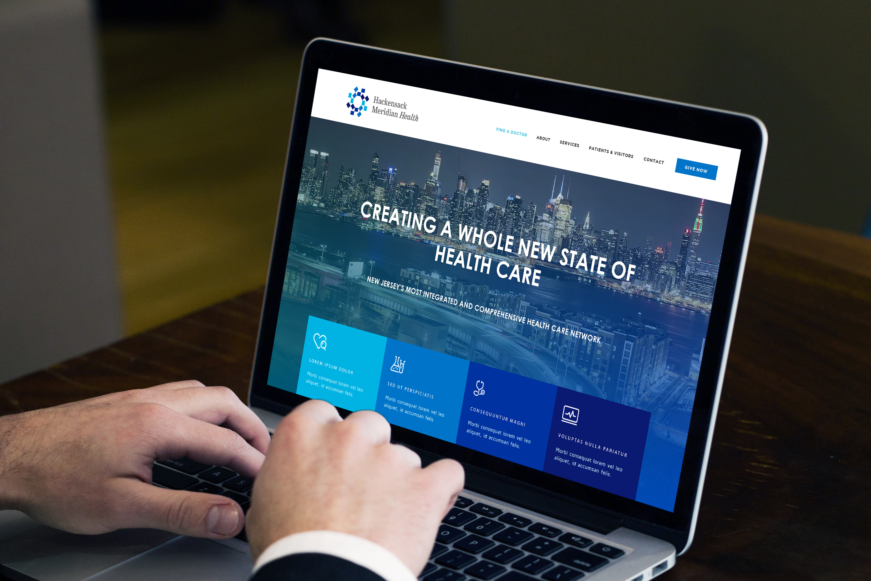
With strong management endorsement behind our winning idea, our design team went to work expanding the concept across a range of prototype applications, demonstrating its potential power, ability to differentiate and versatility. The visuals speak for themselves:
Video by SPM Marketing & Communications (https://www.spmmarketing.com/)
Why It Worked
Though created and implemented under unusual pressure, the work delivers, thanks to a strong team, engaged clients and a collaborative spirit that brought out the best results we could have imagined. In fact, we’d call it “well orchestrated” branding!
HARC Team
Hayes Roth – Founder/Principle
Ken Runkel – Partner, Strategy & Project Lead
Robert Matza – Senior Designer
Joseph Orr – Strategy, Design & Digital Support
Joan Bogin – Research Specialist
Lauren Palladino – Production & Implementation
